IMPORTANCE OF WHITESPACE IN GRAPHIC DESIGN
by admin - 6 Aug 2021
Graphic design and UI design has become an indispensable part of the Internet and social media. As businesses are rapidly making a transition to digital, the field of designing is growing exponentially. With it, the demand for UI designers and digital designers has been on the rise, too. While trying to mark their space in the overly saturated digital designing world, graphic designers leverage their creativity, along with basic design principles to bring out design masterpieces.
In the process, it is natural for a designer to overdo the design with too much content as the marketing world today emphasize content being the king. Contrastingly, including a good deal of white spaces in the design makes it more appealing. Being overwhelmed about designing, they fail to realize using negative spaces is one of the basic design principles that make the design more breathable, accentuating key elements, text and CTAs in the design. If you are still sceptical about including sufficient breathing space in your design, here are a few reasons how negative spaces could benefit your graphic design in a positive way.
WHAT IS WHITESPACE?
White space, also known as negative space, is a space that is left unmarked in a design. It doesn’t necessarily have to be white in color or negative, but it is the space around your design elements, layouts, text, etc. Though called white space, it can have different color, background images and textures.
As a designer, you might include enough white space in the design to make it look clutter-free, and for enhanced user experience, however, the client or the manager might ask you to fill up the gaps and house more information on the design. For them, gaps could be a waste of space, and it is then that you have to make them realize the importance of whitespace in designing.
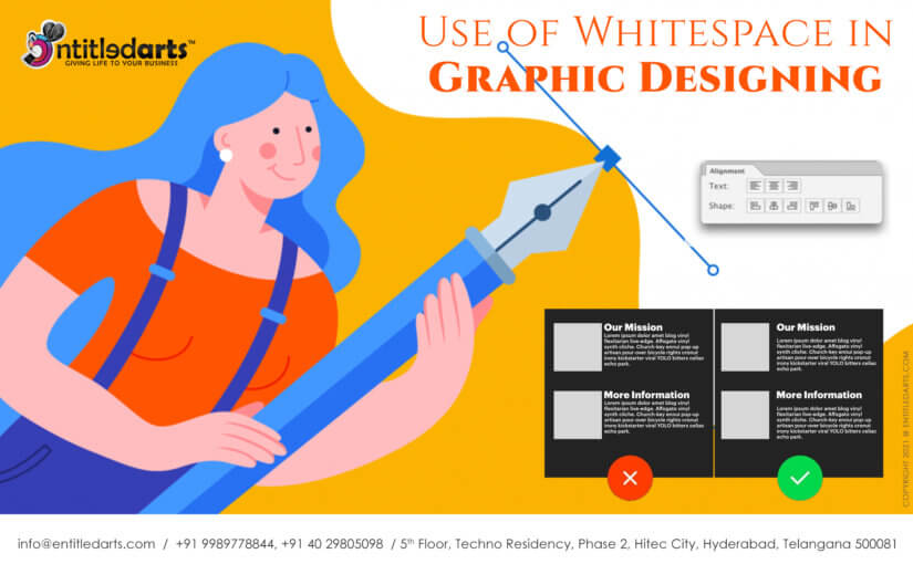
1.IMPROVES LEGIBILITY
Would you like to be bombarded with too much information that has no breathing space? It would be more like getting choked of over-design. It is natural for humans to quit a page or design that has content without spacing and is difficult to read. The content must be such that it is easily scannable with enough space between the lines and paragraphs. The sufficient spacing between the text and the design elements makes the content more legible instead of burdening the eyes and brain.
Two types of whitespaces are used to improve the legibility of the content – micro and macro whitespace. Micro whitespace is the space between the words, lines, paragraphs and smaller design elements. Macro whitespaces are the bigger spaces between two big graphics or the space used to differentiate two different groups of design elements such as the tables, pictures, etc. If you consider a web UI design, the bigger volume of space on the right and left sides of the webpage is known as the macro whitespace.
2.ACCENTUATES FOCAL POINTS
When you include enough information on the page, build a focal point towards the most crucial elements, such as the CTAs. For example, consider you design a poster about an upcoming contest that includes contest details, sponsor details, winning criteria, etc. The prime focal point of this design should be the CTA, such as ‘participate now’ or ‘register now’. Even if you highlight this CTA with different colors, fonts or other design tools, it might get submerged among the other details on the banner. However, if you leave enough white space around the CTA, it would get accentuated and act as a focal point, driving more conversions.
3.ENHANCED USER EXPERIENCE
When your design gets highly saturated with content or designs and animation, people might leave if they do not quickly find what they want. A simple, clutter-free design is what grabs the user’s attention and is not overdesigning. Let’s consider the homepage of Google, how easy it is to access the search bar and get answers to queries! It is because there is enough whitespace on the page that make the search bar easily accessible. Now consider if Google had overloaded their homepage with too much content, would it be as convenient to use? That’s the reason Google’s homepage stands as an exemplary clutter-free and user-friendly design.
4.INCREASED USER INTERACTION
The attention span of humans is too short, and if you can interest the audience in a few seconds, you win the game. As already stated above, white space builds focus on the key elements of the design. The human brain shifts focus to the portion that has enough white space around it and is free from the chaos. When you segregate your key messages from the remaining design with enough negative space around, it helps you deliver key messages instantly and more accurately. When your message is clear, it makes it easier for the audience to make the informed decisions, thereby increasing your leads and conversions.
You know that social media has become a gold mine to generate brand awareness, leads and conversions for the business of all types. As social media is saturated with content, if you wish to drive awareness to your brand or business, keep your social media design simple and the message clear. If you go by the recent trends of social media, minimalism drives more engagement.
5.INVOKES LUXURY
Consider the top luxury brands or the businesses with premium quality branding, one thing common among them is the simple, minimalistic and clutter-free designs. They do not bombard your digital screens with heavy designs or multiple CTAs but keep the prime focus on their product by having enough white space around. Right from the brand logo to the webpage to the product page, every design places its product at the focal point. Minimalism is associated with modern-day luxury designs, and using white spaces is a key to it.
As graphic design can boost your business and sales, it is equally important to leverage the best design tools and practices. Whether it is your web design, social media post design, digital ads, print ads, business cards, newsletters or packaging designs, white space works wonders in every field of graphic design. A good designer strikes the right balance between the content and the whitespace. If you are looking to enhancing branding with exceptional graphic designing or motion designing, connect with Entitledarts, one of the best design and marketing agencies in Hyderabad, India.
0